The Evolution of the Mitsubishi Motors Logo
The iconic three diamonds of Mitsubishi Motors have been around for over 150 years. As the automaker grew from a shipping company to a global brand, its famous logo has been through several incarnations. Let's explore the origins and meanings behind the Mitsubishi logo.
Origins of the Famous Emblem
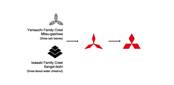
The term "Mitsubishi" originates from its distinctive three-diamond symbol. It is a fusion of the Japanese words 'mitsu' and 'hishi.' 'Mitsu' signifies "three," while 'hishi' translates to "water chestnut" and has long represented a rhombus or diamond shape in Japanese. Interestingly, when the "h" sound appears in the middle of a word, it is commonly pronounced as "b" in Japanese. Thus, the combination of 'mitsu' and 'hishi' becomes 'Mitsubishi' in pronunciation.
Yataro Iwasaki, the founder of the initial Mitsubishi enterprise, adopted the three-diamond emblem as his company's insignia. This emblem draws inspiration from the three-leaf crest of the Tosa Clan, which was Yataro's first employer, and also reflects the three stacked rhombuses found in the Iwasaki family crest.
1870 - The Beginning
The story begins in 1870, when Yataro Iwasaki founded a shipping company named Tsukumo Shokai. The three stacked diamond mark was used as the emblem on ships starting in 1874. It represented the family crest of the Iwasaki clan.
1917 - From Ships to Planes
As the shipping company diversified into other industries, it was renamed Mitsubishi in 1917. The name means "three diamonds" in Japanese. When the company began manufacturing aircraft in 1920, the three diamonds were adopted as the logo for Mitsubishi Aircraft Co.
1970 - Entering Automobiles
In 1970, the Mitsubishi conglomerate entered the automotive industry with its new Mitsubishi Motors division. The classic three diamond logo carried over to this new venture and has adorned Mitsubishi vehicles ever since.
1983 - Enclosing the Diamonds
It wasn't until 1983 that the diamonds became enclosed together in a tri-oval shape, creating the unified Mitsubishi logo we recognize today. This updated look modernized the emblem and helped give it a sleek, aerodynamic feel fitting for vehicles.
2016 - Bold and Simplified
Mitsubishi Motors gave its logo a major refresh in 2016. The redesign enclosed the triangles in a bolder, darker red oval. By simplifying the artwork, the three diamonds gained greater impact. This remains the current logo.
2022 - A Scaled Back Wordmark
Most recently in 2022, Mitsubishi again updated its logo by minimizing the wordmark portion. The company name is now written in a thin, all-caps font below the iconic three diamond emblem. This gives greater prominence to the distinctive triangles, allowing the Diamonds logo to stand out on its own. The simplified wordmark also provides a clean, modern look moving forward.
So in the current logo, focus is drawn directly to the globally recognized Diamonds emblem, with the MITSUBISHI name subtly appearing underneath in a supportive role. This balances heritage and an updated aesthetic. By spotlighting its core visual icon, the brand enters the future with a flexible, adaptable logo identity.
